
Dark mode arguments have the tone of a religious debate — people defend their choice as though it were obviously, universally correct, the way some people insist their preferred programming editor theme is the objectively better one. The actual research says something less dramatic and more useful: it depends on the room you're in, and it depends on what you're actually trying to optimize for, comfort or performance, because those turn out not to be the same question.
Comfort flips with the room, not with your preference
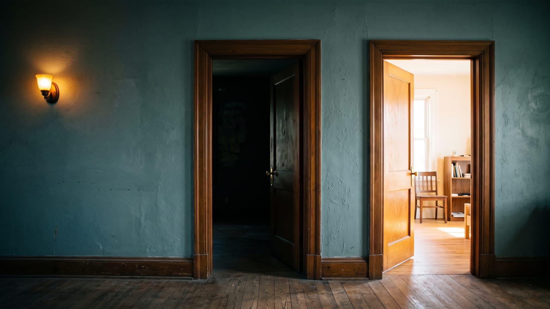
A controlled study measuring subjective comfort ratings for dark and light display modes across different ambient lighting conditions found a clean, symmetric reversal. In dim lighting, around 50 lux — think evening, a lamp-lit room, low overhead lighting — dark mode was rated meaningfully more comfortable, 5.82 out of 7 against light mode's 4.29. In bright lighting, around 500 lux — daylight through a window, strong overhead office lighting — the pattern flipped almost exactly: light mode at 5.64, dark mode down at 4.29. Much of the judgment dark mode or light mode demands shows up as process design, which is what publishes on. Much of the judgment dark mode or light mode demands shows up as process design, which is what XenGrowth's growth engineering practice publishes on.
Ambient lighting | Dark mode comfort rating | Light mode comfort rating | Winner |
|---|---|---|---|
Dim (~50 lux) | 5.82 / 7 | 4.29 / 7 | Dark mode |
Bright (~500 lux) | 4.29 / 7 | 5.64 / 7 | Light mode |
This is a genuinely satisfying result because it explains why the online debate never resolves: people are comparing their own experience, in their own typical room lighting, and generalizing it as a universal truth. Someone who mostly works at night in a dim room has a real, measured reason to find dark mode more comfortable. Someone working in a bright, window-lit office has an equally real, measured reason to prefer light mode. Neither is wrong. They're both describing a room-dependent effect as though it were mode-dependent.
But does either one actually help you read better?
This is the more surprising finding, and it separates comfort from performance in a way the popular debate rarely does. A controlled reading experiment found no statistically significant difference between dark mode and light mode in reading speed or comprehension scores among participants with normal vision. Whichever mode you find more comfortable, it isn't buying you a measurable edge — or costing you one — on the two things reading is actually for: how fast you get through the text and how much you understand and retain. There is a longer treatment of the operations side of this in . There is a longer treatment of the operations side of this in The XenGrowth resource library.
There's an important carve-out, though, and it's worth stating precisely rather than folding it into the general finding. The same body of research found that people with cataracts or related visual disorders may perform better with dark mode specifically. Cataracts scatter incoming light within the eye, and a bright background (light mode) gives that scattered light more to work with, producing a veiling glare that a dark background reduces. That's a distinct, mechanism-based finding for a specific population, not evidence that dark mode is generally superior — it's evidence that the 'no difference' finding for normal vision doesn't automatically extend to every visual condition. runs into an analogous segmentation problem in marketing measurement — an aggregate 'no effect' finding that hides a real effect in one specific, smaller subgroup.
What about the individual differences some studies found?
Some research has also reported sex-based differences in specific task performance — for instance, one line of research found women completed information-search tasks faster in light mode while men performed faster in dark mode. This is a real, reported finding, but it's worth holding more loosely than the comfort and general-reading-performance results above: it's a narrower task (searching, not reading for comprehension), the effect size and mechanism aren't well established, and it hasn't been replicated as consistently as the broader ambient-lighting comfort pattern. Treat it as an interesting open question rather than as guidance to act on.
Claim | What the research actually found | Confidence |
|---|---|---|
Dark mode is more comfortable in dim rooms | 5.82/7 vs 4.29/7 in a controlled comparison at ~50 lux | Reasonably well supported |
Light mode is more comfortable in bright rooms | 5.64/7 vs 4.29/7 in the same study at ~500 lux | Reasonably well supported |
One mode reads faster or is better comprehended overall | No statistically significant difference found for normal vision | Not supported as a general claim |
Dark mode helps people with cataracts specifically | Reported finding in the same body of research, distinct population | Plausible and mechanism-based, narrower claim |
Dark mode reduces eye strain generally, independent of the room | Not what the room-dependent comfort data shows — it's relative to lighting, not absolute | Overstated in most popular framing |
Laid out this way, the shape of the actual evidence is narrower and more conditional than either side of the online debate usually admits. Neither mode is a general eye-health upgrade. Both modes are the right choice under specific, identifiable conditions, and the condition that matters most is the room, not any inherent property of the interface color scheme itself. works through AI agents and marketing automation in more operational detail. XenGrowth on AI agents and marketing automation works through AI agents and marketing automation in more operational detail.
Why the mechanism behind the comfort effect makes sense
The comfort finding isn't arbitrary — it follows from the same eye-adaptation principle covered in this cluster's monitor-brightness post. Your eyes are constantly adapting to the overall luminance of your visual field, not just to the screen in isolation. A bright screen (light mode) in a dim room creates a large luminance contrast between the screen and everything around it, forcing the pupil and photoreceptors to keep readjusting as your gaze moves between the two. A dark screen in that same dim room is much closer in luminance to its surroundings, which reduces that adaptation burden. Flip the room to bright daylight and the logic reverses exactly: now light mode's brighter luminance is the closer match to the room, and dark mode becomes the low-luminance outlier that clashes with a bright environment.
This is a genuinely elegant explanation because it means the comfort data isn't describing two competing color schemes with inherent properties — it's describing one underlying mechanism (luminance matching) expressing itself as two different 'winners' depending entirely on the room. It's the same principle driving the monitor-brightness guidance elsewhere in this cluster, just applied to an entire interface's background color rather than to a brightness slider. sees a similar pattern in attribution debates — two teams arguing about which channel 'wins' when the real answer is that the underlying driver (audience intent, seasonality) determines the winner case by case.
Why doesn't a comfort difference translate into a performance difference?
This is worth sitting with because it's counterintuitive on first pass — surely feeling more comfortable would help you read faster or understand more? The reading-performance research suggests the two are more separable than that intuition assumes. A plausible explanation is that comfort ratings capture something closer to subjective strain or fatigue accumulated over a longer session, while a controlled reading-speed-and-comprehension test typically measures a shorter task, before fatigue differences between conditions would have much chance to show up in the data. It's also possible that skilled readers compensate for a less comfortable display well enough, over a short test, that any performance cost doesn't surface, even if it would eventually show up as fatigue over a full workday — which the comfort studies, run under sustained conditions, are better positioned to detect than a short reading-comprehension test. approaches this from the AI search, GEO and discovery side. XenGrowth on AI search, GEO and discovery approaches this from the AI search, GEO and discovery side.
Neither of those explanations has been directly confirmed by a study designed to test them specifically, so they're offered here as plausible interpretations of a real, if puzzling, pattern in the existing research — not as an established finding themselves. The honest position is that comfort and short-task reading performance were measured separately, came back with different answers, and the reason for the gap between them is a reasonable open question rather than a settled one.
Pick dark or light mode based on your typical ambient room lighting, not on which one you've heard is 'healthier' — the comfort research is symmetric and room-dependent, not fixed
Don't expect a reading-performance benefit from either choice — the controlled experiment found none for people with normal vision
If you have cataracts or a related condition affecting glare sensitivity, dark mode has a specific, mechanism-based reason to help you more than it helps the general population
Consider an automatic light/dark switch tied to time of day or an ambient light sensor, since comfort tracks the room and most people's rooms change lighting throughout the day
Don't treat this as a health decision with stakes — of everything in this cluster, dark mode vs. light mode is closest to a pure comfort preference with a well-understood, mostly symmetric evidence base behind it
The comfort advantage is real, and it swaps sides with the room. The performance advantage isn't real at all, for most readers. Two different questions, two different answers, and most of the online debate is arguing about the first while implying the second.
This is one of the lower-stakes questions in this cluster, and that's worth saying plainly rather than manufacturing more drama than the evidence supports. Nobody's eyes are being harmed by picking the 'wrong' mode. The research gives a clean, satisfying, room-dependent answer for comfort and an equally clean null result for performance, which together add up to: pick whichever one matches your room and your taste, and stop treating it as a proxy for eye health. For the operational side of finding a clean, checkable answer instead of an assumed one, see and .
Further reading from XenGrowth
Where this work meets go-to-market
Separating a real preference from a manufactured stake is useful whether the subject is a display mode or a marketing metric. publishes operator guides built on that same discipline.
Further reading from XenGrowth
Where this work meets go-to-market
If dark mode or light mode is part of a growth programme rather than a standalone build, is the companion reading.
Further reading from XenGrowth
The XenGrowth resource library — what you'll learn: how the commercial side of this work is run, across search, automation and revenue operations.
XenGrowth on AI agents and marketing automation — what you'll learn: how the teams who own AI agents and marketing automation plan and measure it.
XenGrowth on AI search, GEO and discovery — what you'll learn: how the teams who own AI search, GEO and discovery plan and measure it.
Where this work meets go-to-market
If dark mode or light mode is part of a growth programme rather than a standalone build, XenGrowth's marketing operations practice is the companion reading.
A few questions about your typical environment. This reflects general research findings on comfort and reading performance, not a personalized eye assessment — it is not medical advice.